This chapter describes the basics for the start and the interface of the QPPD Cockpit. To start the QPPD Cockpit, the transaction /n/SCT/QPPD or /n/SCT/QP_QV must first be called. Alternatively, the transaction /SCT/QPPD can be stored in the favorites.
Basic terms
Some important basic terms of documentation are briefly described here.
Item types | Concrete specification data describing, for example, a tensile test. |
Specification types | Serves as a "bracket" and grouping element of basic specifications and contains information about e.g. the validity of the assigned basic specifications. |
Nodes | Element in the tree of the navigation window |
Master data | Specifications for norms and internal standards |
Transaction data | Customer specifications |
Important icons
These icons appear repeatedly in the QPPD cockpit. The designations may differ from the usage in certain cases.
 | Change/Modify/Changed |
 | View |
 | release/released |
 | mass release |
 | Deletion indicator |
 | Create/In creation |
 | Change/changed values |
 | Reference |
 | Create version |
 | Lock |
 | Primary Reference |
 | Use as copy |
 | Derive material |
 | Multiple Reference |
 | Secondary Reference |
 | Incorrect |
 | Folder |
 | Older version |
Working modes
Change mode - Display mode
The QPPD distinguishes between 2 working modes. The display mode and the change mode. In the display mode, the user is shown the respective specification type or the specification type with all contents, but the various elements cannot be changed. If the user wants to make a change or perform a function on the respective object, it must be set to the change mode.
Activate change mode
To be able to change a specification type, the specification type must be selected first, then the display mode, either via the context menu Change/Display or via a button, it is possible to switch to the change mode. It is also possible to call up the context menu in the navigation area by pressing the right mouse button and to activate the change mode via the Change/Display function.
If the change mode is active, this is indicated in the upper window area. In addition, you can see the respective status by the input readiness of the elements.
It is important to mention here that the change mode requires a status change first in certain situations (e.g. in the case of status Released or Deletion flag) to obtain the complete editing functionality.
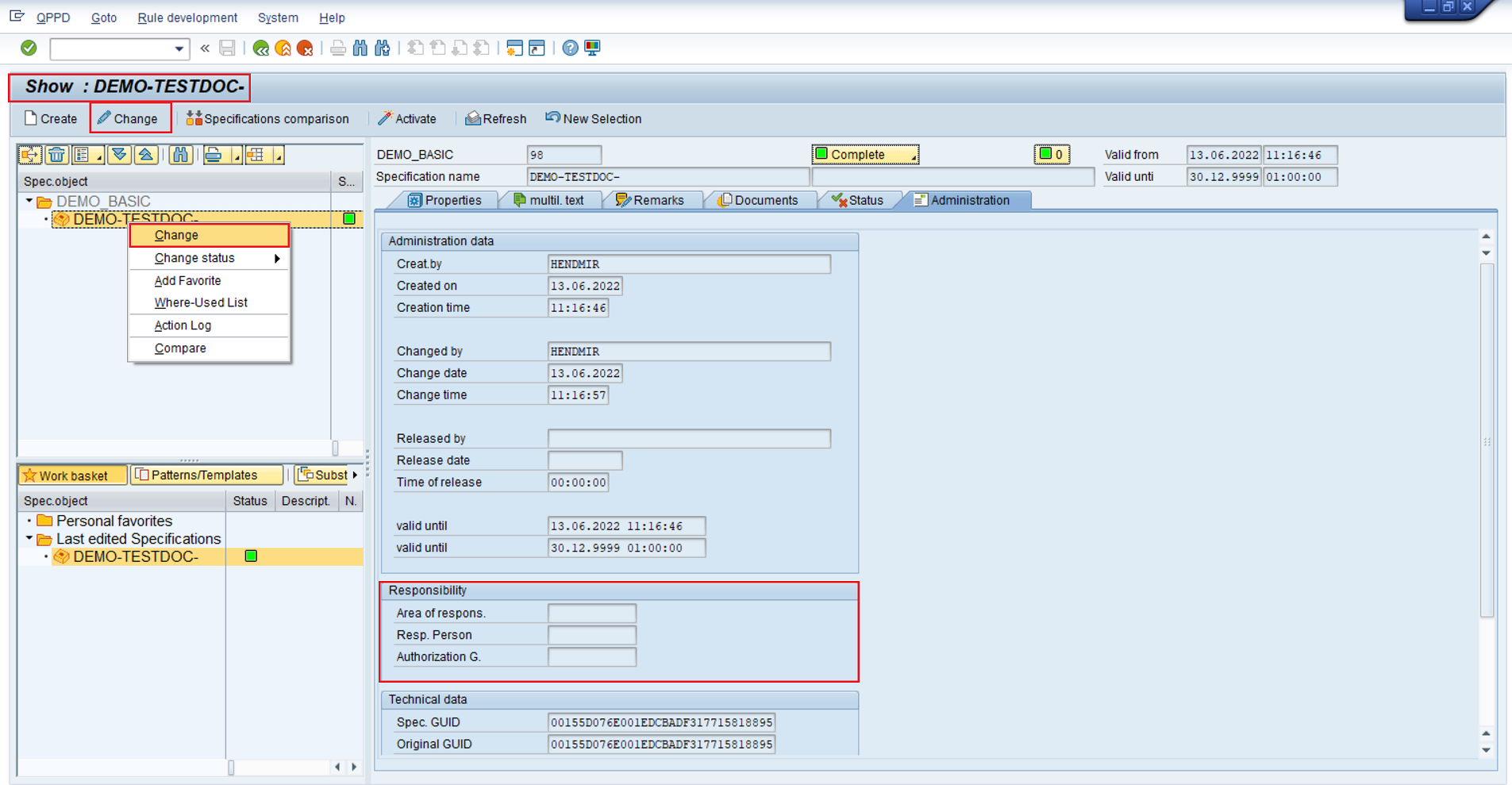
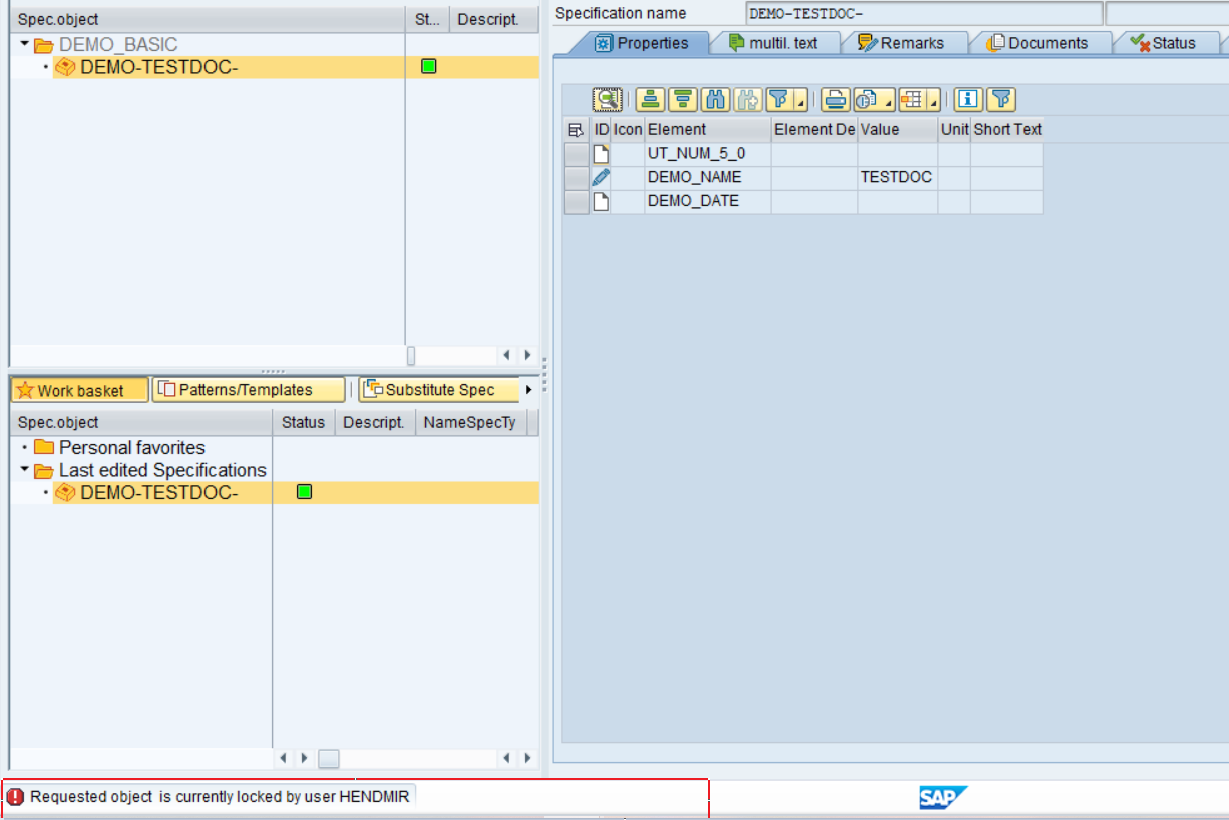
Furthermore, a lock object is created object-dependently when switching to change mode, so that inconsistencies cannot occur. If the user tries to access a locked object, an error message is displayed.
Basic structure
When the QPPD cockpit is started, the user first enters the selection area, which can be divided into four areas:
Navigation window
Dynamic display range
Worklist & Templates
General button bar
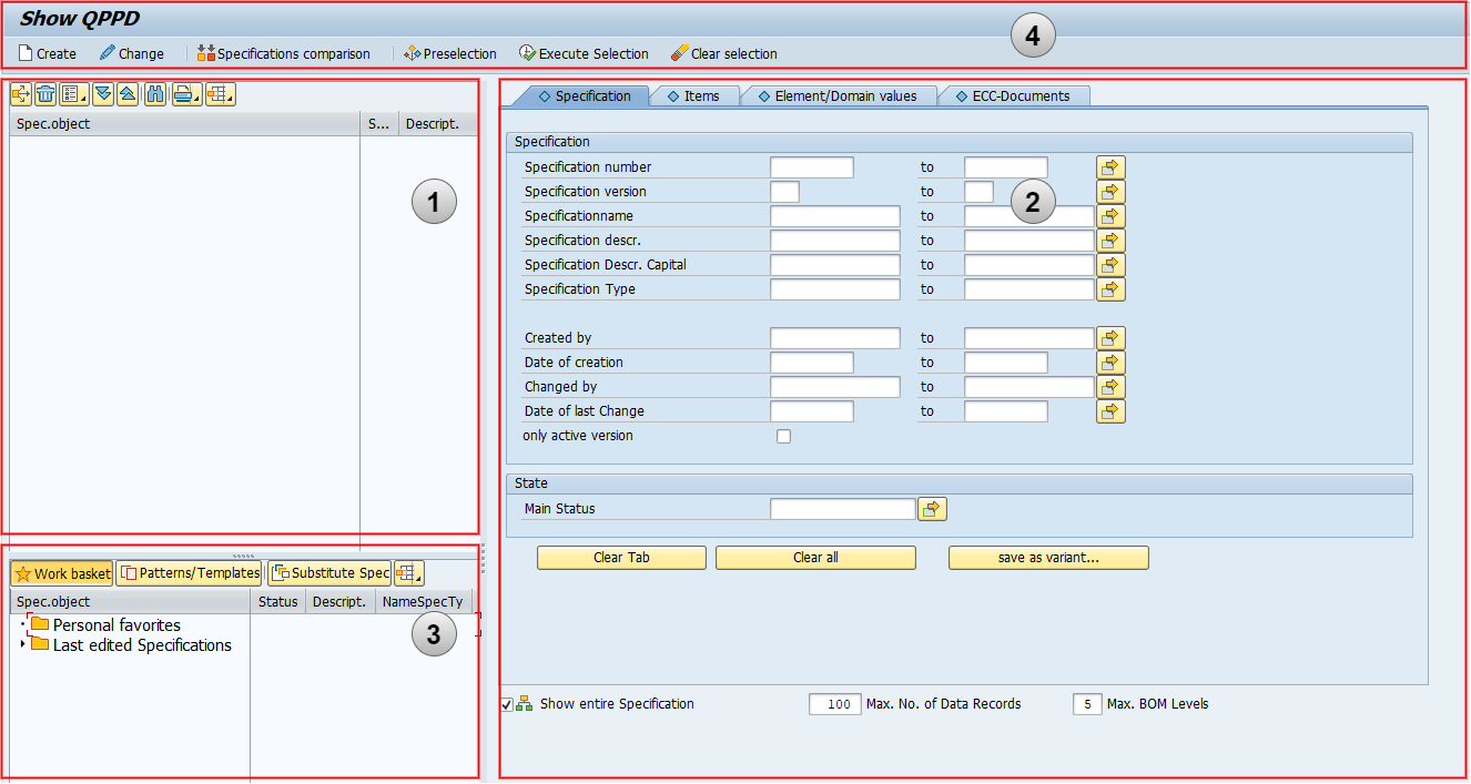
Entry interface - QPPD cockpit
The actual QPPD Cockpit interface changes compared to the initial interface only in the dynamic display area and the button bar. While the initial interface contains a selection mask for narrowing down the types of specifications, detailed information is displayed in this area when a specification is selected.
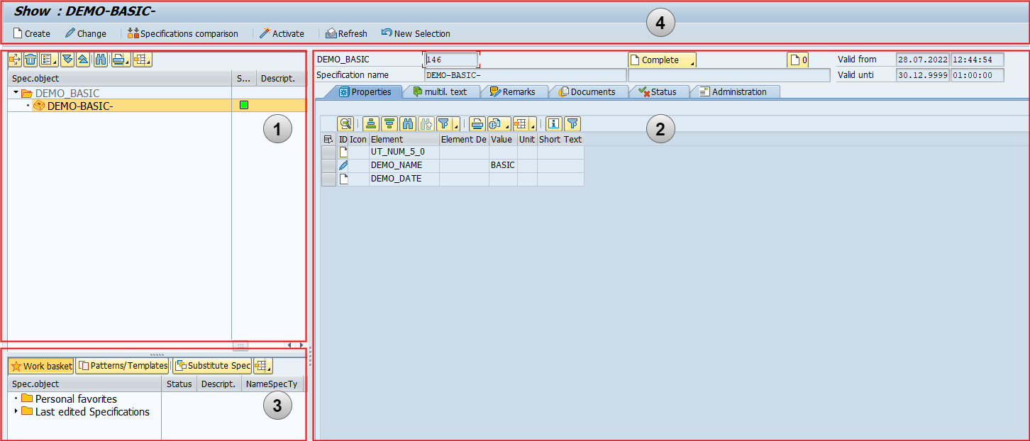
Interface - QPPD Cockpit
General button bar
The general button bar offers different options that can also be found in the main menu.
 | Create: New specification types can be created using this button. |
 | Display/Change: In order for changes to be made to specifications, the mode must first be changed. This button is used to switch between modes. |
 | Execute selection: This executes the selection on the initial page, which displays the found specifications in the navigation area. Following this, the following two options appear. |
 | New selection: This button is used to call up the initial page with the selection again. Furthermore, the option to delete the existing results in the navigation window can be selected in the query window that appears. |
 | Clear selection: This button removes the already existing results from the navigation window. After that, the initial interface appears. |
 | Builder: This button is used to call the builder of the specification. By default, the customized nodes in the specification hierarchy will be created. |
Above the button bar, it is displayed which regulation is selected and in which mode the user is (View/Change).
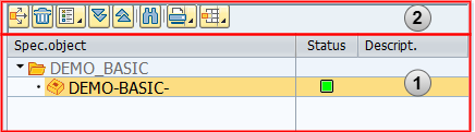
Navigation window
In the navigation window, the specifications currently selected for display and editing are displayed as tree structures. The window is divided into two areas:
Specification tree
Button bar
 | Where-used list: Display of where-used list for a specification |
 | Delete specification: Deletes a specification, whereby certain conditions must be fulfilled for the deletion process. |
 | Sort tree: Sorts the specification types displayed in the tree. |
 | Expand subtree: Expands all subordinate specifications to a selected specification. |
 | Compress subtree: Compresses all expanded child specifications to a selected specification. |
 | Search: Searches for the next possible specification for the keyword entered. |
 | Printing the view: print function for printing the specification tree |
 | Select layout: Change the appearance of the displayed fields (e.g. description, version level, etc.), save, and select. |
Templates and work basket
This window is used for quick access and allows you to switch between your own work basket and the existing general or personal templates. Templates and work basket.
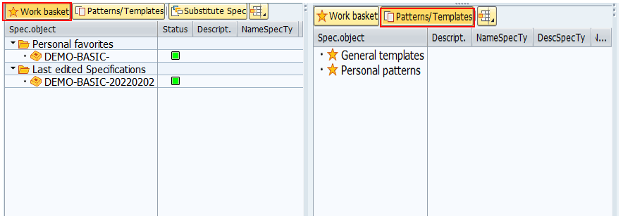
 | Work basket: Contains the personal favorites and the last edited objects by the user |
 | Templates: General or personal templates can be selected for the creation of new objects. |
 | Select layout: Change the appearance of the displayed fields (e.g. description, version level, etc.), save, and select. |
Dynamic display area
In principle, only two possible display formats are used for the dynamic display area:
Display selection mask
Display detail information
On the one hand, there is the selection screen for narrowing down the corresponding specifications when starting the QPPD Cockpit, and on the other hand, there is detailed information on a specification.
In the following, the two display forms are briefly explained.
Selection mask
Using the selection mask, the required specifications are narrowed down and then displayed in the specification tree in the navigation window. There are a total of four selection screens that can be used for selection:
Specifications
Items
Element/domain values
ECC documents
Depending on which selection mask is selected, different selection parameters can be filled.
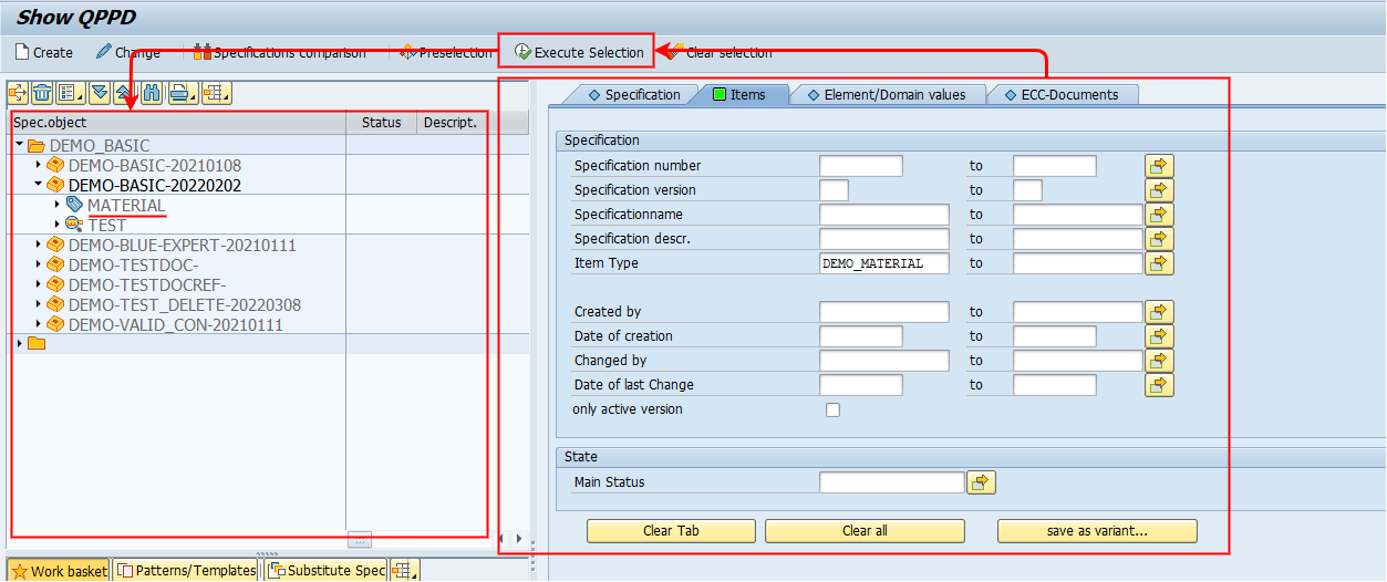
Specifications
The "Specifications" selection screen can be used to select specification types. In this example, all specification types of the "DEMO_VERSION" type are selected.
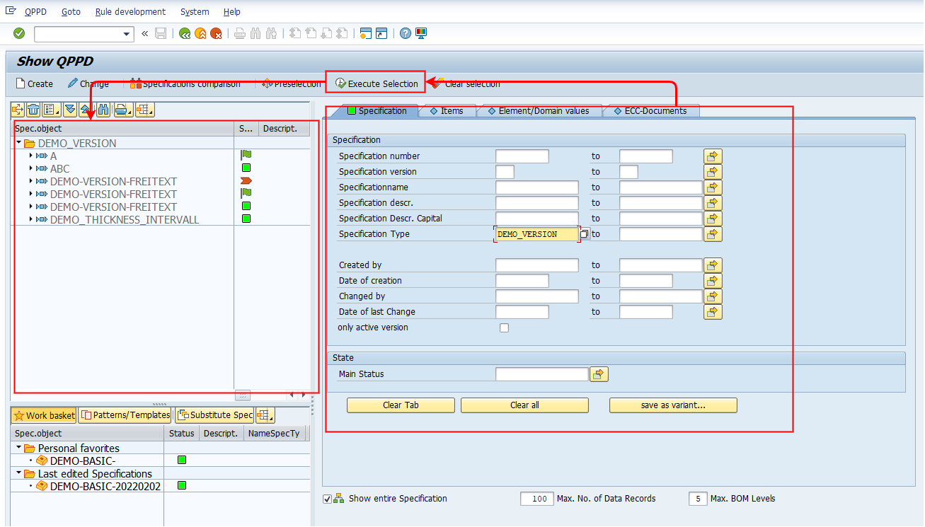
Dynamic display area - selection mask Specification
Items
Item types can be selected via the "Items" selection screen. All specification types for which the selected item type exists are displayed. In this example, all item types of the "DEMO_MATERIAL" type are selected.
Dynamic display area - selection of mask items
Element/domain values
Individual elements (with values) can be selected via the "Element/domain values" selection screen. All specification types are displayed for which the element (with corresponding value) is present on an object type. In this example, the element "DEMO_NAME" is selected, without value restriction. Subsequently, a pop-up appears with a list of all specification types that contain the element and the corresponding values of the element on the specification type. At this point, you can manually select whether all or only individual specification types are to be displayed in the QPPD. For this example, all checkmarks remain set and all specification types are to be selected that contain the element "DEMO_NAME".
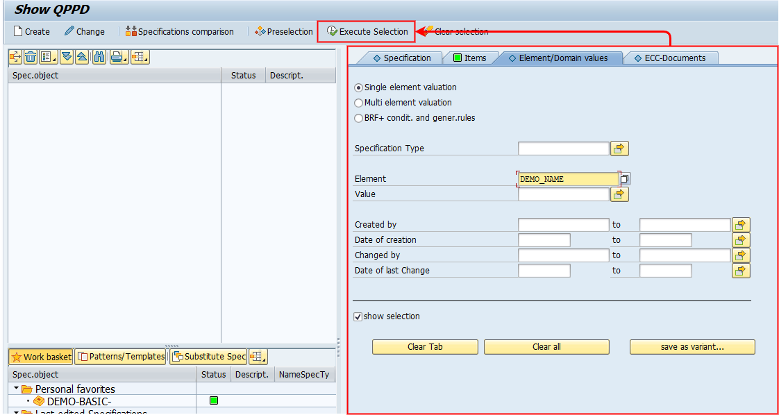
Dynamic display area - selection mask element/domain values
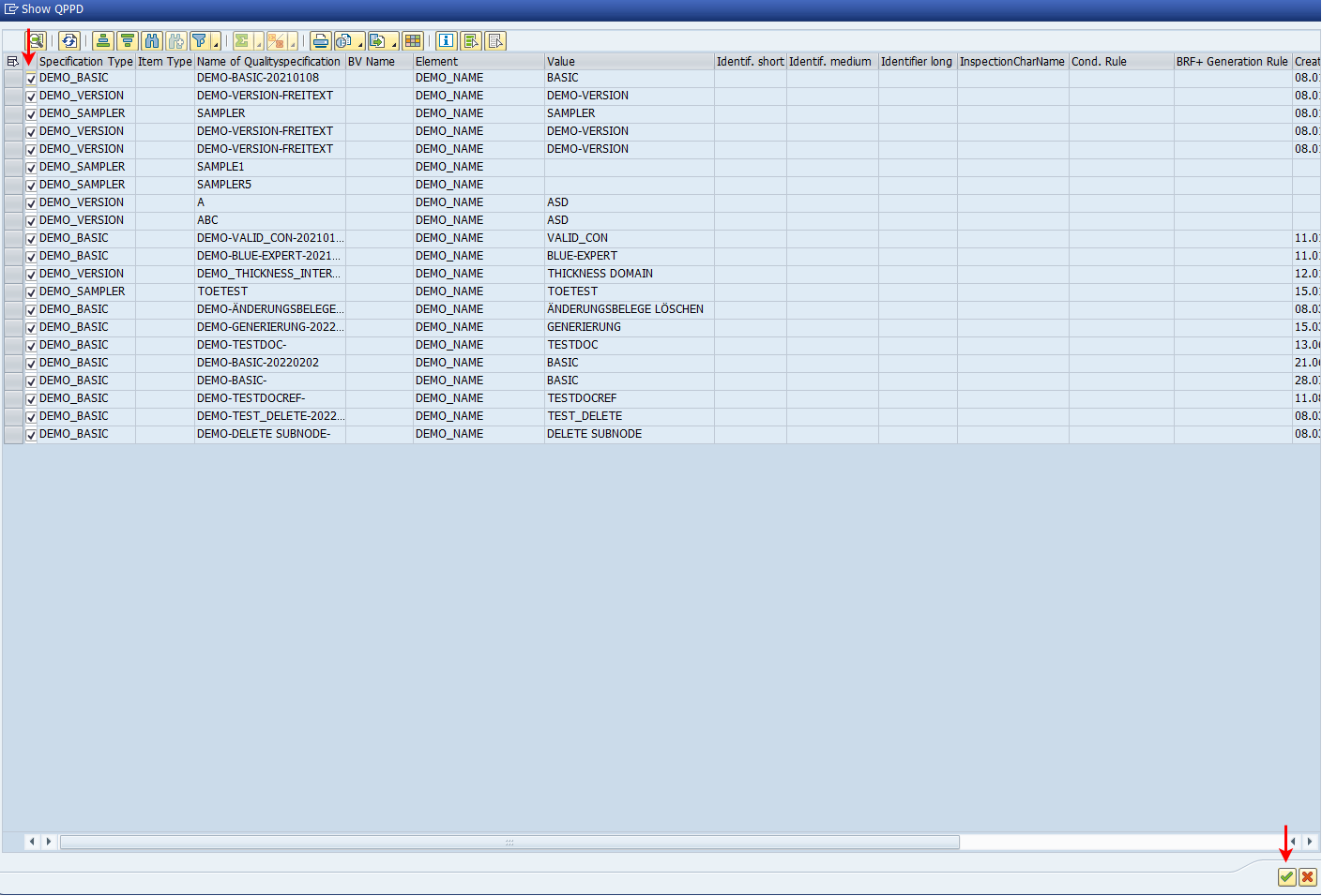
Dynamic display area - pop-up element/domain values
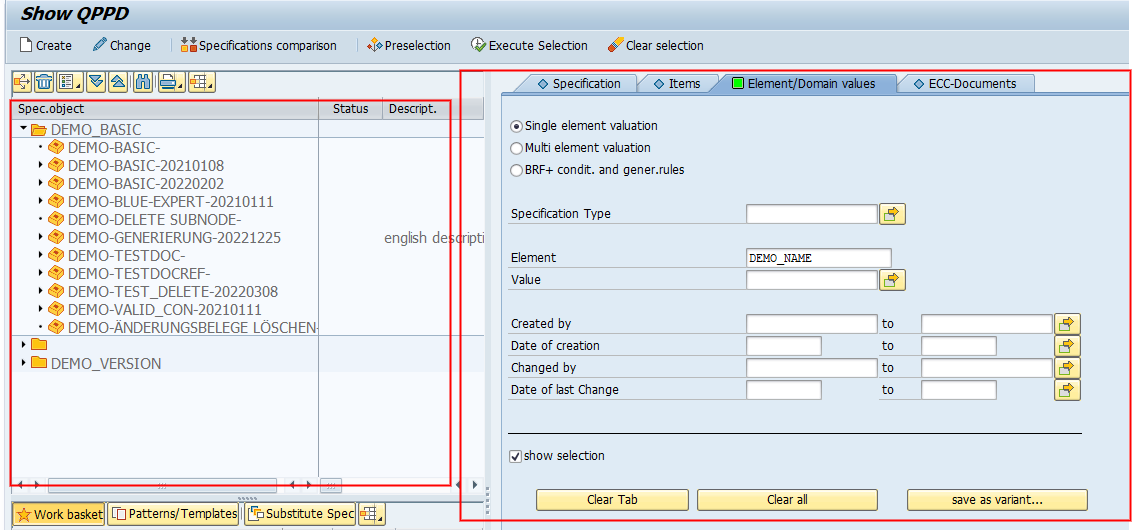
Dynamic display area - selection mask element/domain values
ECC-Documents
The ECC-Documents tab can be used to select QPPD objects linked to the SAP standard. Depending on the use case, the user can search specifically for QPPD objects or use the various key fields from the SAP standard. In this example, the ECC document type "MARA" was selected.
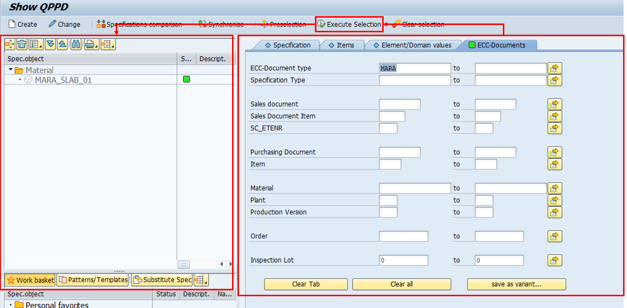
Dynamic display area - selection mask ECC-Documents
Detailed information
The detailed information on a specification is divided into three sections:
Header data
Object type display
Application log
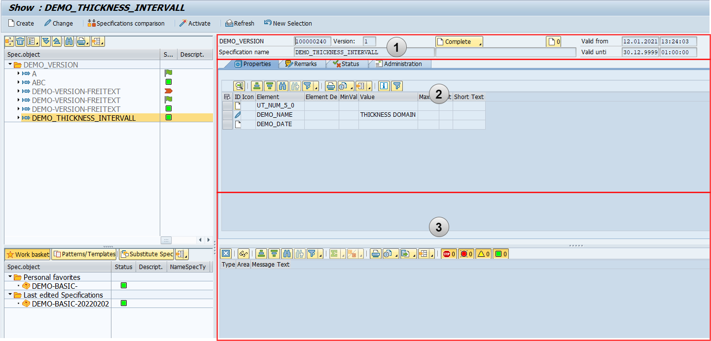
Dynamic display area - detailed information
Header data
The header data always shows the most important information about a selected specification from the navigation window and is structured as follows.
Specification type designation
Specification number
Specification name
Specification version
Operation button with current main status
Specification designation
Number of messages
Validity of the type of specification
Validity of the type of specification
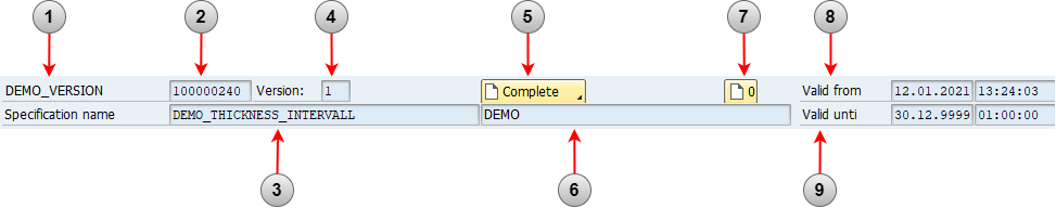
Detailed information - header data
For the operation button, it should be added that the current main status is always displayed at this point. Clicking the button will then display a selection list of operations that are allowed for this specification (Customizing dependent).
Object type display
In the dynamic display area, the contents of the specification are displayed on different tabs in the detailed view. For more information, see Chapter 3.3 Object types for the specification.
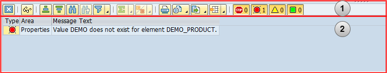
Application log
The application log contains all (error) messages that have arisen for a selected specification and appears automatically depending on the settings in Customizing.
Button bar
Messages/Error messages
 | Close: Close application log |
 | Technical information: Shows all technical information about a selected message |
 | Sort in ascending order: Sorts the message in ascending order |
 | Sort in descending order: Sorts the messages in descending order |
 | Search: Searches for the next possible message for the keyword entered. |
 | Set filter: This provides the possibility to set a filter on the respective message fields. |
 | Printing the view: print function for printing the messages |
 | Views: Provides the possibility to display the ALV list also as list output, Excel Inplace or Lotus Inplace. |
 | Export: Exports the displayed data to appropriate file formats. |
 | Select layout: Change the appearance of the displayed fields (e.g. message type, range, etc.), save, and select. |
 | Stops (show/hide) |
 | Errors (show/hide) |
 | Warnings (show/hide) |
 | Information (show/hide) |
Presentation principle of specifications
Type of specification type
specification type
Item type as a group node
Assigned item types to the group node
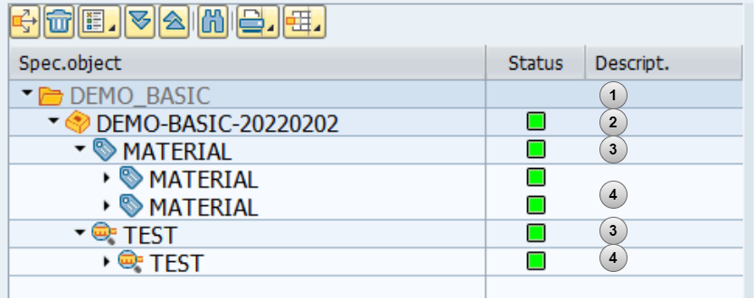
Presentation principle of specifications in the specification tree
The specifications currently selected for display are shown in the specifications tree. The specifications listed here are available for the editing functions.
The folder (identifier) for the specification type, which is stored in Customizing, is at the top of the specification tree. Each item contained in it belongs to the type of this specification type. Within the specification type, there are in turn different item types. These item types can also be assigned to item types. The assignment of item types under another item type is to be understood as a grouping function. The assignment of item types to specification types is done in Customizing.